This tutorial was written by Tierney Steelberg, Digital Liberal Arts Specialist at Grinnell College’s DLAC (Digital Liberal Arts Collaborative). The tutorial framework was created by Sarah Purcell, L. F. Parker Professor of History at Grinnell College. This tutorial was reviewed by Maddie Matsubara, Vivero Digital Fellow.
 This work is licensed under a Creative Commons Attribution-NonCommercial-ShareAlike 4.0 International License.
Table of Contents
Click any link to head to that section.
- What is ArcGIS Online?
- Web Maps
- Layers
- Accessibility
- Sharing Your Map
- In Preparation for Thursday 9/29
- Get Help
What is ArcGIS Online?
ArcGIS Online is a cloud-based online mapping software that allows you to create complex digital maps for data analysis, as well as easily share them with others. ArcGIS Online replicates many of the functions of the ArcGIS software application, though it is not quite as powerful.
In this course, you will be using ArcGIS Online to map historical data from the Iowa Townships Project.
Logging In
Everyone at Grinnell has access to ArcGIS Online through the College. You can access your account by logging in with your Grinnell College credentials at https://grinnell.maps.arcgis.com/home/index.html. It is used in the browser, so you do not need to download anything special onto your computer.
Downloading Data
A selection of datasets for this workshop can be found in this OneDrive folder. We’ll upload this data into ArcGIS Online in order to map and analyze it, before pulling into StoryMaps. For this, we’ll be working with CSVs or, optionally, shapefiles.
Shapefiles are a file format for storing geographical location and attribute information data, and they are actually made up of a grouping of individual files, compressed into a single .zip file that is uploaded all at once to ArcGIS Online. The OneDrive folder contains town of Grinnell and merged multi-township data for both the 1900s and the 1920s, in the form of both shapefiles (compressed .zip files) and spreadsheets. The town of Grinnell Geocoding Result shapefile data takes the form of points, and the merged townships shapefile data takes the form of polygons.
In our walkthrough together, we’ll use the 1900 Town of Grinnell CSV data, but you can use any dataset you would like when you work on making your own maps.
- What do you notice about this data?
- What do you have questions about?
- What historical questions or stories do you think this data set might help to answer, if visualized on a map?
As a back-up case of issues, you can also try downloading the 1900 Town of Grinnell CSV data hosted here in WordPress instead of OneDrive.
Web Maps
What’s a web map? Esri, the company behind ArcGIS and ArcGIS Online, describes a web map as “an interactive display of geographic information that you can use to tell stories and answer questions” (source: Web maps).
Creating a New Map
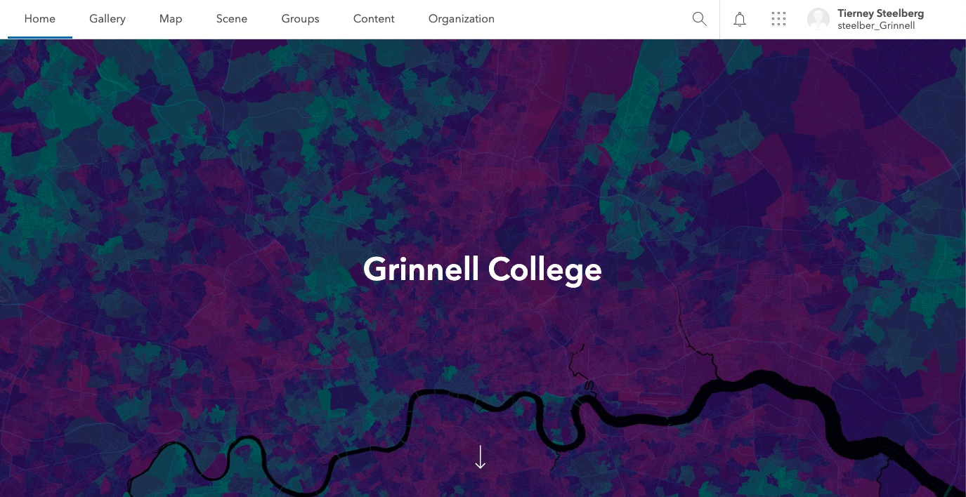
Click Map in the top level menu of your ArcGIS Online homepage to create a new map. From there, you will be taken to a new blank map for you to make your own!
Note: for the purposes of this tutorial, we will use Map Viewer Classic, which allows us to upload data by file. The new Map Viewer does not have this feature yet. Click “Open in Map Viewer Classic” at the top right of the map menu to switch over.
Customizing a Map’s Appearance
 You can customize the way your map looks by clicking Basemap in the top level menu of the map view, and then selecting your chosen basemap. You can change this at any time, so can come back and make edits for the best base map for your purposes once your data has been added to the map.
Saving Your Map
Click the Save button on the top level menu of the map view, then click Save As to save a new map or a new copy of an existing map: you will be prompted to give your new map a title and tags (required, but you can choose any you would like), and to add a summary, if desired. If you are working with a pre-existing map, just click Save to keep saving it to the same place – make sure to do this regularly while you are working so your changes are saved. 
Returning to an Existing Map
Click Content in the top level menu (available when you click the Home button if you are currently viewing a map or other content) to see all your saved content and return to an existing map. Click the title of an existing map, then click the Open in Map Viewer button (top right) to continue editing.
Layers
What’s a layer? A layer is a collection of specific geographic data added to your map. Maps can have multiple layers that can be shown concurrently or hidden as needed to allow you to interrogate the interactions of multiple data sets or to focus where you need to.
Adding Layers
There are a couple different ways to add layers – for the purposes of this class, we will be adding layers of data from the Iowa Townships project by file. Our data takes the form of shapefiles (compressed in .zip format) and CSVs. These files will show up on our map layers in the form of points or polygons. As previously mentioned, for our first run-through together we’ll work with the Grinnell_1900_Geocoding_Result CSV file, which is points data relating to the Town of Grinnell – for your later assignment, you can play around with additional data sets.
- Click the +Add button at the left of the top-level menu.
- Select Add Layer from File.
- Upload the CSV file.
- Click the Import Layer button.
- You now have the option of choosing what attribute to show, and how to customize the way your layer’s data is being visualized.
- To keep it simple for our work together on Tuesday 9/27, let’s start by visualizing the total number of people in each household. Select the TotalHH attribute from the dropdown list, then select the default Counts and Amounts (Size) drawing style. We’ll customize this later.
- When you’re ready, click the Done button at the bottom.
- You should now see the data added as a content layer, on the left-hand panel of your map.
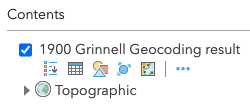 Once a layer has been added to your map, a variety of options appear for you when you hover over a layer’s name in the Content menu of your map. From left to right:
- The Show Legend button pops out your layer’s legend for you.
- Please note that the ArcGIS Online legend is automatically generated based on the titles of the attributes in your dataset. You cannot customize it from within your map.
- The Show Table button gives a preview of your data in table form, at the bottom of your map.
- The Change Style button allows you to customize your data visualization style – more on that below!
- In the case of points data, the Cluster Points button lets you configure clustering to better extract information from your data.
- Per Esri: “If your map has a layer with a large number of points, you can configure clustering to make it easier to visually extract meaningful information from your data.” (Source: Configure clustering)
- The More Options button lets you select from a variety of other customization and viewing options, as needed.
 You can use the checkbox by the layer’s name to show/hide layers as needed.
Making Copies of Layers
You may find it helpful to make copies of your layers, so you can use the separate copies to analyze different aspects of the data. To do so, simply click the “more options” button under the layer’s name when you hover over it, and select Copy. You can rename your copy using the Rename option under the same more options menu.
Customizing Layers
There are a variety of options for you in customizing your layers, depending on the attribute upon which you want to focus. Choose an attribute from the list (basically, one of the columns of census data in the shapefile’s data spreadsheet) and play around with how you want to visualize it! ArcGIS Online lets you customize most aspects of the visualization. Hover over the layer you’re working with and click the Change Style button (feel free to make a copy first if you want to play around with a couple of different viewing options). Choose an attribute to show from the dropdown, then select a drawing style underneath (different options appear depending on whether the attribute is numeric or textual/categorical).
You can also scroll down to the bottom and choose New expression to write a script that creates a custom expression to mathematically manipulate attributes in some way. For example, with the census data, you could combine the attributes for numbers of children of different genders and age groupings to get the total number of household members aged 17 and under, with a custom expression along the lines of $feature[“Male_Under_5”] + $feature[“Male_5_to_17”] + $feature[“Female_Under_5”] + $feature[“Fem_5_to_17”]7.
Textual/Categorical Data (race, jobs, schooling, heritage…)
- Types (Unique symbols), which shows different categories as different colors
- Location (Single symbol), which simply shows the location of your data (as a point or as a polygon)
The visual aspects (like size, color, symbol, transparency) can be customized.
Numeric Data (acreage, ages, number of people in a household, number of grandparents born in Iowa or in the US…)
- Counts and Amounts (Size), which uses symbol size to represent your numeric data
- Counts and Amounts (Color), which uses a color scheme to represent your numeric data
- Location (Single symbol), which simply shows the location of your data (as a point or as a polygon)
- Types (Unique symbols), which shows different categories as different colors
- and for points data, Heat Map, which shows areas of high activity in colors that appear “hotter”
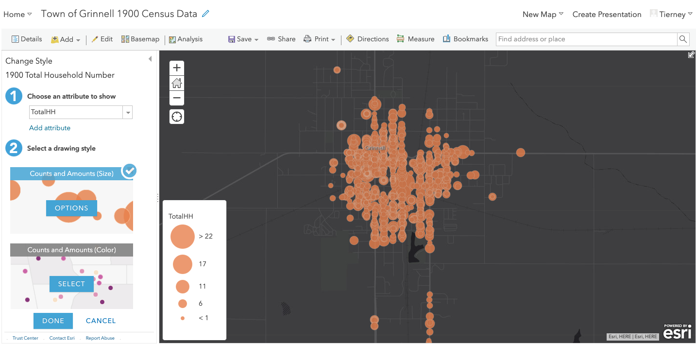

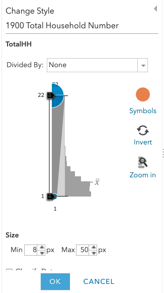 Click the Options button at the center of the selected drawing style to customize the visualization on your map. Each of the options outlined can be customized – both the visual aspects (like size, color, symbol, transparency) and some of the numeric aspects (such as data classification and breakpoints). You can use the Divided By dropdown to choose to divide a numeric attribute by another numeric attribute (for example, to calculate a percentage).
After selecting an attribute from the dropdown, you can click Add attribute to add a second attribute, if certain conditions are met (one of the attributes is numeric one and the other is categorical OR both attributes are numeric). You can then customize the appearances of both. You can use this feature to map two attributes at once, for example, Total Household size and whether the family owns or rents their home. If the two attributes you want to map cannot be mapped together on a single layer, you can create multiple layers and adjust their transparencies to show overlap or showcase them in separate map images. Once you’re finished customizing, make sure to click the blue Done button at the bottom of the viewing pane to make sure your changes are saved.
- What do you notice about your visualization as you change its drawing style and customize its appearance?
- In the case of numeric data, spend some time playing around with breakpoints using the Classify Data options – try out different types of breaks, and different numbers of classes. What makes sense for the attribute you’ve chosen?
- What is gained and what is lost with different visualization options?
Configuring Pop-Ups
You can configure the pop-ups that appear when you click on your data points. By default, they show all of the information from that point’s row in your data table – but some or most of this information may not be needed depending on what you are trying to showcase with your map. 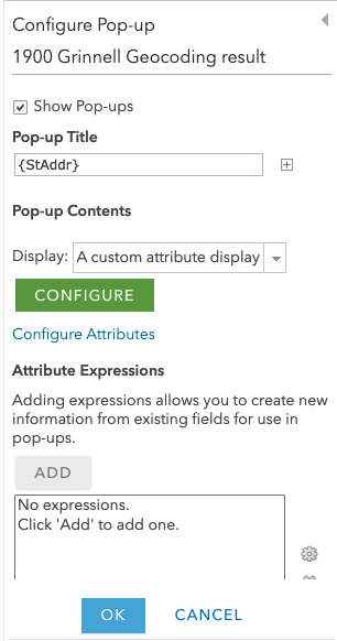 To configure a pop-up, hover over the layer you’re working with and click the More Options button, then the Configure Pop-Up option. At the top of the pane, you can select a pop-up title based on an attribute. In the Display dropdown below, you can decide if you want to display:
- a list of attributes (which you can customize below using the Configure Attributes – you can choose which ones you want to appear)
- a description from one field
- a custom attribute display
- no attribute information
Don’t forget to click the OK button at the bottom of the pane when you’re done customizing your pop-up, to save your changes.  In the case of a custom attribute display, you can click the green Configure button and lay out the information you want to display. You will see a basic text editor for formatting, and you can use the small + button to pull in the IDs of the attributes you want to display. When you’re finished, click the blue OK button at the bottom of your text box. For example, “The {Lastname} household has {TotalHH} members in total.” pulls in both the name and total household attributes as a sentence. In the case of this data, the attribute fields may be somewhat opaque to someone unfamiliar with the data set, so if you were displaying this data more publicly, and focusing on some information in particular, it could make sense to customize the attribute display (and reduce the number of fields, since many might not be relevant to a casual viewer).
Accessibility
What is web accessibility? “Web accessibility is the inclusive practice of ensuring there are no barriers that prevent interaction with, or access to, websites on the World Wide Web by people with physical disabilities, situational disabilities, and socio-economic restrictions on bandwidth and speed.” (Wikipedia). As you create your map, keep accessibility at the forefront of your mind:
- be careful in your use of color and ensure appropriate color contrasts and differentiation (basemap, layer colors…)
- consider how you can avoid using color alone to convey meaning: vary labels and color, utilize different shapes, change both size and color value of the same shape (source: “Improving Accessibility with ArcGIS Online Web Mapping Apps” presentation from Esri)
- be thoughtful about your text content (pop-ups, map descriptions, and more): break up walls of text, ensure appropriate typeface and font size when you are customizing, provide links that make sense out of context (i.e., no “click here”)
You can use these resources to check your work:
- check color contrasts with WebAIM’s Contrast Checker
- check accessible color selection with Toptal’s Colorblind Web Page Filter, the Color Oracle software, or the Colorblindly Chrome extension
Sharing Your Map
By default, maps are private when you first create them, and visible only to you. This is great for drafting, but most maps ultimately need to be shared with and visible to others! You can do this in a couple of different ways, depending on your needs.
Printing Your Map
You can “print” a copy of your map to share it with others as a static document. The print button will print your map exactly as you are looking at it in that moment in time: before clicking it, make sure any layers you want visible are currently selected, and make sure to zoom in or out as much as desired. Then simply click the Print icon the top level menu of the map view, and then select Map with Legend to make sure your legend is printed as well. A new simplified page will load (it may take a few minutes) from which you can print your map – or save it as a PDF to your computer. 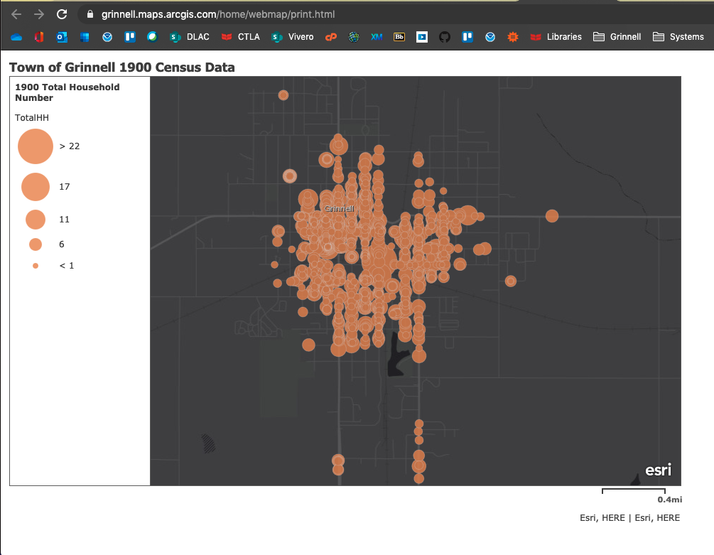
Adjusting Map Sharing Settings
You can share an ArcGIS Online map with others on the web. To do this, click the Share button at the top of your map editing page, or navigate to the content page showing all your existing content, click the title of an existing map, then click the Share button. When you’re finished, don’t forget to scroll down to the bottom of the pop-up and click Done or Save to save your sharing settings.  There are several sharing levels:
- owner: visible only to you, the creator
- organization: visible to all members in our organization, Grinnell College
- everyone (public): visible to the wider community outside of Grinnell College
It is also possible to create a “shared update” group for sharing, which allows multiple people to work on the same map at once (similar to the collaborative editing features in Office 365). You are not able to create “shared update” groups on your own: this must be done by an admin.
To be able to embed your map on an external website, you need to make sure it is set to the “public” sharing setting. Once you have done so, you can click the Embed in Website button to customize your embed settings. Your map does not need to be shared publicly to be shared more widely as a web app – more on that below.
For this class, if “printing” your map as a PDF does not work well (some students have experienced issues with their map symbology and colors changing in the print view), you can share the map with Prof. Purcell using the share link. Make sure your map is shared at the organization level, or she will not be able to see it even with the link.
Creating a Web App
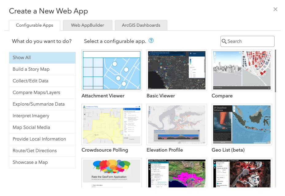 What’s a web app? A web app allows you to share a customized and streamlined view of your map with external viewers. Changes made to your map are reflected on its web app version. You are not required to create a web app from your map for any of this course’s assignments. But if you are interested in playing around with this feature, you can follow these instructions from Esri: https://doc.arcgis.com/en/arcgis-online/create-maps/create-map-apps.htm#ESRI_SECTION1_2F3804B3E2C849F997784C121868A242
In Preparation for Thursday 9/29
Between now and class on Thursday 9/29, spend some time thinking about this question: what is a good historical question that can be investigated, and the answer visualized, using this data set? Class on 9/29 will be a guided work session where you will work on using ArcGIS Online to map what you have come up with.
Get Help
If you have questions, need help, get stuck, or want support trying something new, there are many support resources out there for you!
- Swing by Vivero drop-in peer mentoring hours: Vivero Digital Fellows trained in a variety of digital tools and approaches hold peer mentoring drop-in hours from 7-9 PM in the Burling Library Media Room (lower level) Sundays through Thursdays every week while classes are in session.
- Contact Tierney Steelberg, Digital Liberal Arts Specialist, via email at steelber@grinnell.edu: Tierney is available to help you with questions, technical issues, and trying out new things
- Make use of Esri’s great ArcGIS Online documentation, especially their resources relating to creating web maps
